Quantcast
Channel: Blogs from Sarina D - Embarcadero Community
Viewing all 112 articles
Browse latest View live

Using the new TAddressBook component on iOS and Android in RAD Studio 10.1 Berlin

$
0
0

With the new TAddressBook component for FireMonkey in RAD Studio 10.1 Berlin, you can access your contacts on both iOS and Android. You can access all or individual contacts, create new contacts, edit or remove contacts, create groups and more.

Stephen Ball wrote a great blog post on TAddressBook. You can view it here.

I showed the new contacts component during yesterday's webinar. Click below to watch the recording.


[YoutubeButton url='https://www.youtube.com/watch?v=UIgCg2qG3kc']

Read more

Customizing the style for a user interface control in RAD Studio 10.1 Berlin

$
0
0

The integrated Style Designer in RAD Studio 10.1 Berlin has undergone several changes and improvements, including:

  • Clipboard, keyboard and multi-selection support on the Structure view
  • Preview panel
  • Zooming support

I recently received a question from a customer on how to best customize a style for a specific component, and I thought I'd cover the steps in a blog post. In this tutorial, we are going to change the background color of TGroupBox.


Step 1: Create a new FireMonkey Multi-Device Application

Launch RAD Studio 10.1 Berlin, and navigate to File > New > Multi-Device Application. The steps are the same for both Delphi and C++. From the Tool Palette, drag and drop TGroupBox onto your form.


Step 2: Launch the integrated Style Designer

Right-click on the TGroupBox FireMonkey control and select 'Edit Default Style'. Make sure you have the platform selected that you want to customize the style for (i.e. iOS, Android etc). If you want to customize the fill color for TGroupBox on multiple platforms, you are going to want to repeat these steps. In this example, I am going to customize TGroupBox on iOS.


Step 3: Add a Timage to change the background fill color

With GroupBoxStyle > background selected, select TImage from the Tool Palette. TImage should be nested under 'background'. Also note that 'iOS' is selected from the 'Platform' drop-down menu.


Step 4: Load your custom image and define some properties

With TImage (Image1Style) selected, navigate to the Object Inspector and select MultiResBitmap. Select an image from your hard drive with the fill color you want to use (i.e. blue.png). Select Align = Client and WrapMode = Stretch. Hit Close to apply and save the changes. If you want to change the style for TGroupBox on other platforms, you can just select each additional platform from the drop-down menu in the Style Designer and then repeat steps 3 and 4.

Tip: If you don't want the text to be covered by the background fill (on Windows, for example), then I would recommend using these settings:

GroupBoxStyle.Padding = (0, 0, 0, 0)
Text.Position.Y = 0


[DownloadButton Product='RAD' Caption='Download the Free RAD Studio 10.1 Trial Today ']

[BuyButton Product='RAD' Caption='Buy RAD Studio 10.1 ']


Read more

RAD Studio 10.1 Berlin Bonus Pack - Premium Style Packs for VCL and FireMonkey

$
0
0

If you purchase Delphi, C++Builder or RAD Studio 10.1 Berlin, you get access to the premium style packs for both VCL and FireMonkey that are part of our bonus pack. New in the 10.1 Berlin style packs is the addition of a dark copper style for both VCL and FireMonkey.

The FireMonkey Premium Style Pack for 10.1 Berlin includes nine custom FireMonkey styles. Choose from Jet, Sterling, Diamond, Emerald Crystal, Emerald Dark, Coral Crystal, Coral Dark, Vapor, Copper, Copper Dark and Radiant styles, optimized for iOS, Android, Windows and Mac application development.

Download at: http://cc.embarcadero.com/item/30491


The VCL Premium Style Pack for 10.1 Berlin includes eight premium VCL styles included in this style pack. Choose from the Coral, Diamond, Emerald, Sterling, Jet, Vapor, Copper, Copper Dark and Radiant styles to change the look of your application.

Download at: http://cc.embarcadero.com/item/30492


[DownloadButton Product='RAD' Caption='Download a free trial today!']


Read more

UI Design Tips and Tricks: Home Screen Navigation

$
0
0

During our recent RAD Server webinar, we showed you how to develop and deploy a real world customer retail application. The client app shown is designed to run on smartphones and the server side will execute on IIS production servers on premises and on Amazon EC2 (you can also host a RAD Server application on Microsoft Azure and other cloud servers).

The client app allows customers to look up price and descriptions of products in the store using product barcodes and by keying in product SKUs. The app also enhances the customer experience and facilitates marketing programs by lighting up an end-cap product display as the customer nears a target product. The app can also send sale prices to the customer via push notifications when the customer enters the store or is near a relevant sale item.

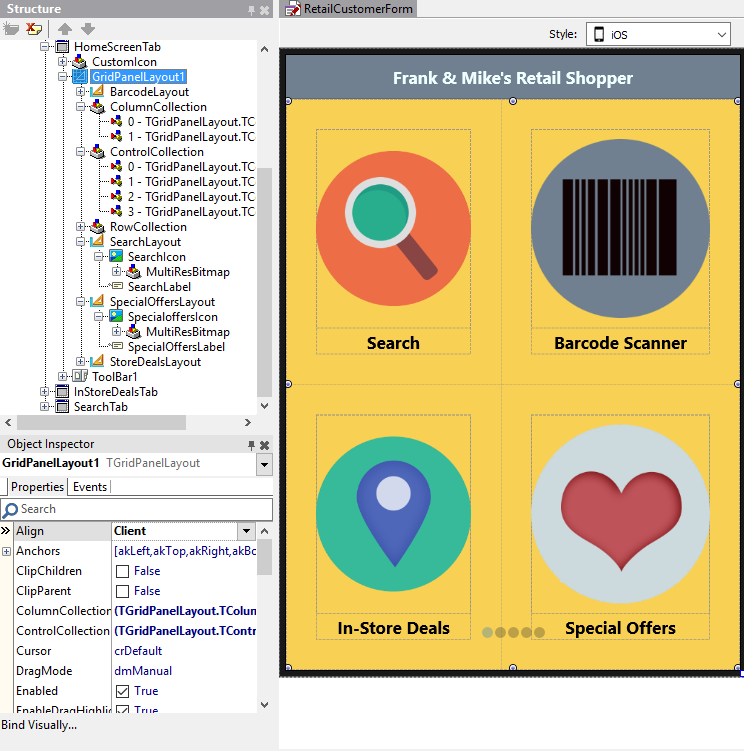
In today's blog post, I wanted to describe the steps for creating the Home Screen design seen on the first tab of the application. Home screens are a popular design paradigm as they display the key app functionality on the first screen, making it easily accessible to the application user. Home Screen navigation usually consists of glyph buttons arranged in a grid like layout and may span over multiple screens.


Step 1:  Set up the UI

This application consists of 6 tabs, with TTabControl's TabPosition property set to None. To set up the Home Screen design, add a toolbar and a label to Tab 1 (HomeScreenTab). Set TToolbar's Align property to Top, and TLabel's Align property to Contents, and the Text Settings HorzAlign property to Center. Next, add a TGridPanelLayout control to Tab1 and align it to Client.


Step 2: Adjust the TGridPanelLayout settings

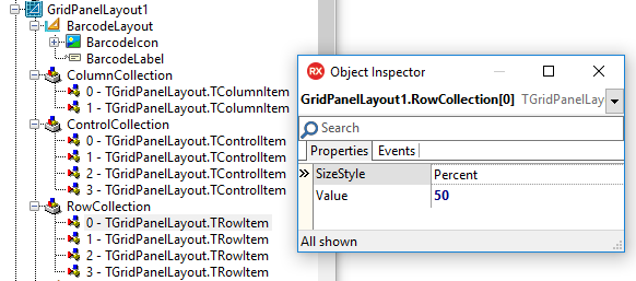
With GridPanelLayout1 selected in the Object Inspector, drag and drop a TLayout control onto your form. Repeat these steps 3 times.  Align each TLayout control to the client. This ensures even spacing and alignment for each of the 4 icons. Select the ColumnCollection property for GridPanelLayout1 in the Object Inspector. Set the % for each column to 50% to ensure the columns are evenly spaced. Repeat this step for the RowCollection property.


Step 3: Add images and text

Select each Layout control in the Object Inspector, and parent a TImage control and TLabel to it. Align each TImage to the client. Align each TLabel to the bottom. 


Step 4: Set margins, adjust font settings and more 
Select each layout control in the Object Inspector and set your margins. In my example, I set bottom, top, left and right to 30. I then created views for each of my target devices (iPhone 4.7 inch, Android 5 inch etc.) and adjusted the margins and font size to ensure the text and images were displayed properly on each of my target devices. By selecting the ControlCollection property in the Object Inspector, you can also adjust the placement and order of each of your layouts.


Here is an example of the application running on an iPhone 6s:

[DownloadButton Product='RAD' Caption='Download a RAD Studio Trial today!']


Read more

UI Best Practices for Building Mobile Applications - Webinar Replay

$
0
0

We had a great webinar last week on getting started building multi-device applications for iOS and Android with RAD Studio. You can access the entire webinar replay here.

To access my portion of the webinar that focused on UI best practices for building mobile applications, click on the image below.


My UI focused slides from the webinar start at slide 9 and can be accessed by going to: http://www.slideshare.net/embarcaderotechnet/getting-started-building-mobile-applications-for-ios-and-android


[DownloadButton Product='Delphi' Caption='Download a free Delphi 10.1 Berlin Trial today!']


Read more

Variable Item Height with TListView in 10.1 Berlin

$
0
0

During a recent webinar, we received a question on how to create a list in a FireMonkey multi-device application using RAD Studio Berlin where the item height automatically adjusts itself depending on the content.

We have a great new demo that shows you how to calculate text dimensions and how to dynamically adjust the item height in a ListView so that the text fits inside.

When ListView items are just being created, the drawable objects that comprise the visual presentation of the content are not created immediately. This usually happens when the ListView is being painted for the first time.

Appearances specify views and their properties that are common for all items. However, to modify individual items, the drawable objects that form the views should be manipulated directly. They can be accessed at any time, however trying to manipulate them before the appearance has done its job would not make much sense because all changes made before that will be overwritten by the appearance.

In order to access the drawable objects at the correct time, there is an event called TListView.OnUpdateObjects which is called for every item after its view has been updated. This demo implements a handler for it and calculates item dimensions based on available width and length of the text that the item contains. To liven up the visual aspect of the demo, the size and weight of the font is also altered in the same handler.

procedure TVariableHeight.ListView1UpdateObjects(const Sender: TObject;
  const AItem: TListViewItem);
var
  Drawable: TListItemText;
  SizeImg: TListItemImage;
  Text: string;
  AvailableWidth: Single;
begin
  SizeImg := TListItemImage(AItem.View.FindDrawable('imgSize'));
  AvailableWidth := TListView(Sender).Width - TListView(Sender).ItemSpaces.Left
    - TListView(Sender).ItemSpaces.Right - SizeImg.Width;

  // Find the text drawable which is used to calcualte item size.
  // For dynamic appearance, use item name.
  // For classic appearances use TListViewItem.TObjectNames.Text
  // Drawable := TListItemText(AItem.View.FindDrawable(TListViewItem.TObjectNames.Text));
  Drawable := TListItemText(AItem.View.FindDrawable('txtMain'));
  Text := Drawable.Text;

  // Randomize the font when updating for the first time
  if Drawable.TagFloat = 0 then
  begin
    Drawable.Font.Size := 1; // Ensure that default font sizes do not play against us
    Drawable.Font.Size := 10 + Random(4) * 4;

    Drawable.TagFloat := Drawable.Font.Size;
    if Text.Length < 100 then
      Drawable.Font.Style := [TFontStyle.fsBold];
  end;

  // Calculate item height based on text in the drawable
  AItem.Height := GetTextHeight(Drawable, AvailableWidth, Text);
  Drawable.Height := AItem.Height;
  Drawable.Width := AvailableWidth;

  SizeImg.OwnsBitmap := False;
  SizeImg.Bitmap := GetDimensionBitmap(SizeImg.Width, AItem.Height);
end;

The demo uses DynamicAppearance for the items, but the same approach can be used using the classic appearances, predefined or user defined.

You can access the demo here:

https://sourceforge.net/p/radstudiodemos/code/HEAD/tree/branches/RADStudio_Berlin/Object%20Pascal/Multi-Device%20Samples/User%20Interface/ListView/VariableHeightItems/


 [DownloadButton Product='RAD' Caption='Download a Free RAD Studio Berlin Trial today!']


Read more

Using TAddressBook to create, access and manage contacts on iOS and Android

$
0
0

RAD Studio 10.1 Berlin includes TAddressBook, a new FireMonkey component for creating, accessing and managing contacts on iOS and Android. 

We have a great new demo that shows you how to create a new contact, access all on-device contacts and create and manage groups.


Read more

Using TImageList with TListView in RAD Studio 10.1 Berlin

$
0
0

We have a great new FireMonkey demo for RAD Studio 10.1 Berlin that shows you how to populate TListView with images from a TImageList component. FireMonkey image lists are collections of multi-resolution bitmaps. Image lists are used to efficiently manage large collections of icons or bitmaps.

Our demo shows you how to use TListView together with TImageList. TListView items with images can use bitmaps directly, bitmaps referenced from elsewhere or bitmaps specified as indices in an ImageList. Depending on the kind of appearance used, there are different ways to select an ImageIndex.


Read more

Berlin Update 1 Sneak Peek: TGrid Native Rendering on iOS

$
0
0

If you read Brandon Shopp's blog post on what we currently have in flight, you saw that we have been working on Update 1 for RAD Studio 10.1 Berlin, and are down to the final handful of bugs to address and will then enter the testing and acceptance phase.  Update 1 will consist of approximately 250 fixes along with several new features.

One of those new features will be native rendering support for TGrid on iOS, and I thought I would give you a sneak peak today of what's coming.


Read more

Konopka VCL Controls & Radiant Shapes now part of the Berlin Bonus Pack

$
0
0

It’s exciting for us to share some more great news! Konopka VCL Controls and Radiant Shapes are now part of the free Berlin Bonus Pack - for a limited time. Read below to see what we are including in the Bonus Pack and learn more about the offer.


Read more

Adding a photo to a contact using TAddressBook in Berlin

$
0
0

In 10.1 Berlin, we introduced TAddressBook, a new FireMonkey component for creating, accessing and managing contacts on iOS and Android. 

We have updated our existing FireMonkey contacts demo and added the ability to add a photo to each contact you create. This demo uses our built-in actions for selecting an image from the gallery or taking a photo using the camera on your device. 


Read more

Over 50 IoT Components available in 10.1 Berlin

$
0
0

Available via GetIt in 10.1 Berlin are over 50 IoT device components.

These components cover popular IoT devices ranging from healthcare to fitness and home automation. Included are both BluetoothLE (BLE) and Z-Wave device components.


We have a separate IoT docwiki to help you get started building applications that connect to the Internet of Things.

You can find the included sample projects for Delphi and C++ in the following directories after installing each IoT component:

  • Start | Programs | Embarcadero RAD Studio Berlin | Samples and then navigate to:
    • Delphi: Internet of Things\Object Pascal\Thing Connect\
    • C++: Internet of Things\CPP\Thing Connect\

[YoutubeButton url='https://www.youtube.com/watch?v=lh8B6aIcO-Q']


[DownloadButton Product='Delphi' Caption='Download the trial and start building IoT applications today!']


Read more

Taskbar Notification Badge support in Windows 10 Anniversary Update

$
0
0

With RAD Studio Berlin, you can build applications for Windows 10 with support for local notifications. Today, I thought I would show you an example of our Notifications demo that is included with RAD Studio Berlin running on Windows 10 Anniversary Update.

This includes notification badge icon support to indicate that a new notification has been received. This is a new feature in the Anniversary Update that you can leverage in your VCL and FireMonkey applications today. 

As you can see in the screenshot below, a notification badge (1) showing the number of current notifications is shown.

Windows 10 Windows 10 Anniversary Update


Windows 10 Notification Samples:

Object Pascal:

CPP:


Windows 10 Anniversary Update Webinar with Marco Cantu - Sign Up Today

For more information on RAD Studio Berlin's unmatched support for Windows 10 Anniversary Update, check out Marco's blog post.

[DownloadButton Product='Delphi' Caption='Download a Delphi trial today!']


Read more

Build apps for macOS Sierra and iOS 10 with RAD Studio Berlin Update 1

$
0
0

Last week, Apple released iOS 10. Today, Apple released macOS Sierra, the latest version of its Mac operating system.

Berlin Subscription Update 1 introduces support for targeting iOS 10 and macOS Sierra in both your Delphi and C++Builder applications.

In the screenshots below, you can see our Object Pascal TWebBrowser sample application running on both MacOS Sierra and iOS 10.


Read more

See What's New in Berlin Update 1 Video

$
0
0

See the key new RAD Studio Berlin Update 1 features in action:


10% off RAD Studio, Delphi, C++ Builder

Get on the latest edition of RAD Studio, Delphi, and C++ and get 10% OFF when you buy Professional or above (valid until 30th September) with promo code BERLIN10.


Read more

New IoT Device Components in RAD Studio Berlin Update 1

$
0
0

RAD Studio Berlin offers more than 50 Internet of Things device components. This includes support for popular Bluetooth LE and Z-Wave IoT devices ranging from healthcare to fitness and home automation. A couple of new IoT device components have been added in Subscription Update 1 and are available for download via the GetIt Package Manager (Tools > GetIt Package Manager).


Read more

Filtering support for custom ListView layouts in Update 1

$
0
0

In RAD Studio Berlin, we added a new ListView Item Designer for FireMonkey applications that allows you to easily design custom ListView layouts.


Read more

Getting Started Building Multi-Device Applications

$
0
0

With RAD Studio Berlin, we provide a guided tour to help you get started building your first multi-device application.

The guided tour is accessible from the Welcome Page.


For more info on the Guided Tours, click here.

[DownloadButton Product='Delphi' Caption='Download the Delphi 10.1 Berlin Trial today!']


Read more

Konopka VCL Controls & Radiant Shapes now part of the Berlin Bonus Pack

$
0
0

It’s exciting for us to share some more great news! Konopka VCL Controls and Radiant Shapes are now part of the free Berlin Bonus Pack - for a limited time. Read below to see what we are including in the Bonus Pack and learn more about the offer.


Read more

Adding a photo to a contact using TAddressBook in Berlin

$
0
0

In 10.1 Berlin, we introduced TAddressBook, a new FireMonkey component for creating, accessing and managing contacts on iOS and Android. 

We have updated our existing FireMonkey contacts demo and added the ability to add a photo to each contact you create. This demo uses our built-in actions for selecting an image from the gallery or taking a photo using the camera on your device. 


Read more
Viewing all 112 articles
Browse latest View live


<script src="https://jsc.adskeeper.com/r/s/rssing.com.1596347.js" async> </script>